

A project aimed at developing the clients corporate appeal and marketing strategies in preparation for a conference event, whilst building upon a previously outline brand.
Wilderness Expertise Marketing & Brand Development
I worked with…
Wilderness Expertise
2024
“Since 1994, our experienced team of specialist outdoor facilitators have been providing innovative, high quality leadership training, team building and personal development programmes to schools and corporates, both across the UK and internationally.
We are passionate about developing long term, trusted partnerships, delivering tailored events to meet our clients’ objectives.”
Client
Wilderness Expertise | Jo Pender & Claire Pinder
Year
2024
Initially being a project that focused on reaching a new and more mature target audience, this quickly became a bid to improve the visual identity of the company in order to create a coherent outlook of the assets produced, and opportunity for a more professional appeal. Although the push to the final product was pressured by the corporate conference, the client also requested the assets to be suitable for not only their new found corporate clients, but also homing in on their existing clients of schools and other learning facilities.
We agreed to the following deliverables:
Developed Colour Scheme 1 Vertical Banner (800mm x 2000mm) Business Cards Promotional Leaflet

By keeping in close contact, my client and I curated a marketing project that aimed at enticing a more corporate audience. This was in anticipation of an up and coming corporate event of which the Wilderness Expertise team were to set a space up which represented their company and were given the opportunity to pitch their unique selling points and benefits to potential client.


-
Introducing an extra colour to help enhance the visual identity of the brand. This will help create more variety and will also be great for call to action systems which require standing out.
-
This will be a great tool for standing out amongst a large crowd, perfect for the conference. Similarly, a banner is fitting for the adventurous, outdoors characteristics of the brand where clients may be further away.
-
As expected, business cards were introduced here to full fill the purpose of providing clients with crucial contact information. Acting as a quick reminded of who they may have met.
-
We decided a leaflet would be beneficial as a ‘refer back too’ tool - something that briefly outlines key goals and behaviours.
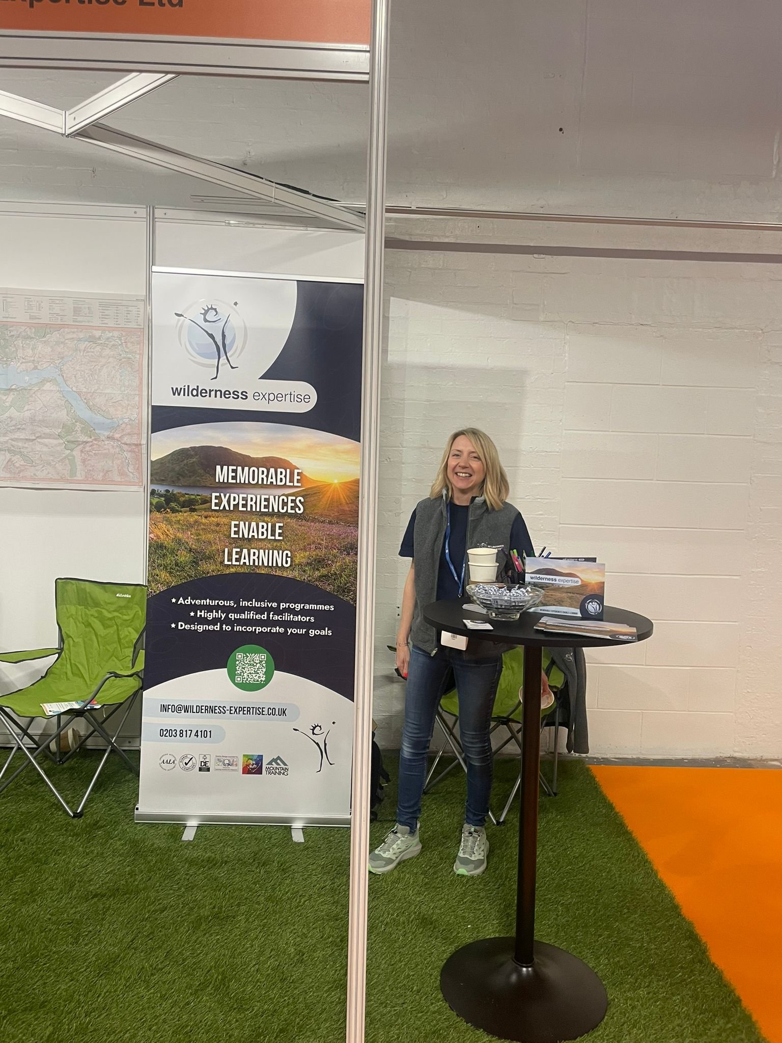
Banner

Outline:
This part of the project was focused on attracting attention from potential whilst also acting as promotional purpose in the event of outdoor activities
Format:
800mmx2000mm Vertical Banner
Aims:
Standing out from the crowd
High quality images
Coherent visual identity
Solutions:
Using striking images and unique arrangement
Using representative stock images to ensure the highest quality images that create a more professional appeal
Using colours, shapes and tones seen throughout the other assets. The image seen here is also seen on the front and back cover of the leaflet
Leaflet

Outline:
This part of the project was focused on a more personable marketing approach. The leaflet was the act as a tool that potential clients can remind themselves of the service Wilderness offer.
Format:
Single tent-fold

Aims:
Promote and market
High quality images
Coherent visual identity
Solutions:
Include a breakdown of services and act as a tool of general knowledge
Using representative stock images to ensure the highest quality images that create a more professional appeal
Using colours, shapes and tones seen throughout the other assets. The image seen here is also seen on the front and back cover of the leaflet
