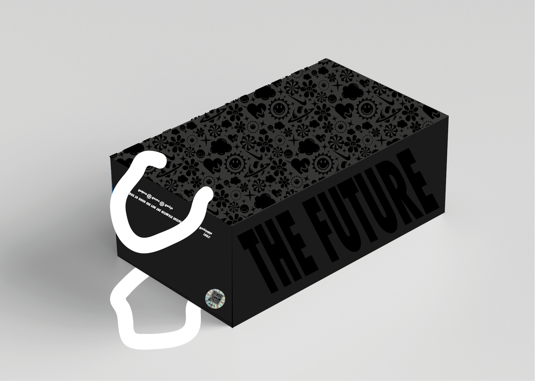
Redesigning a Nike shoe box, specifically the Move to Zero, Air sector. This was a sustainably focused project that challenged eco-friendly and disruptive printing & packaging concepts.
Move to Zero Nike Shoebox ReDesign
Move to Zero Shoebox Redesign
As part of this university project I was set out to redesign a product that I felt needed attention. The brief was extremely vague so of course(!) I decided to redesign a Nike shoebox, more specifically for the Move to Zero range.
I chose this particular redesign because I felt that the Move to Zero's current shoebox design lacked the charismatic and innovative nature of the company Nike themselves - instead it represents the typically boring, brown, sustainable packaging (something which I wanted to challenge).
Skip to the good part
Initial Proposition 1
Here i’m using a wrap around technique for the typography, for an interesting yet subtle touch with this being presented in a matt black contrary to the glossy surface. I have also considered the colour blue as a representation of the ocean.
Initial Proposition 2
This idea presents a slightly bolder suggestion whilst still using white and holographic as a universal approach to colour to avoid gender miscommunications. In both of these concepts I have included a handle for the box meaning a bag is not require at check out.
Workfile: Research, Development & Explanation.
Semi-Final Proposition
Left Side
Right Side
My final mockup design depends on a series on printing techniques that allows for a much more interesting user experience as well as being sustainable. I discovered in research that foiling was an extremely sustainable and eco-friendly printing technique due to its endless recyclability, as well as being extremely striking - the perfect fit for this project! The pull out drawer asset to this design allows for a much better user experience, further enforcing the endless uses for reusing this box for the likes of storage. The ribbon handles are easily removable as well as encouraging the shoebox to act as a bag during transport and transaction.
After designing and creating a mockup for my proposed design, I took a step back to truly analyse the effectiveness of my design decisions based upon my main outlined values. This process of working really helped me to bring my ideas to life and allowed me the ability to feel the essence of my designs. This design did not execute the way I had imagined and so it was back to the drawing board to perfect this concept.
Back to the drawing board

The Final Designs
The prototype and a series of corresponding designs making up a collection

Mailing Bag // Discrete in appearance and subtle in colour, enhancing the values of the brands original designs whilst still remaining authentic and complimentary to the proposed redesign.

Travel Mug Range // This deliverable focuses on the value of sustainability seen throughout this project. The designs also replicate both the inside and the outside of the design seen on the shoebox.

Tote Bag Range // Similar to the travel mug concept, this concept also focuses on the dominating sustainability value which encourages users to indulge in reusable items as opposed to plastic bags and cups which are things that are universally damaging.

Showcased here is a selection of some of my deliverables which coincide and compliment one another seamlessly as outlined in the brief.
My final design is evidence of the hard work pursued throughout this project. This design showcases a contemporary approach to a growing market of sustainability. The prototype is intended to encourage customers to reuse the box to a further extent and as a result of this introducing a longer life to the box itself. This is practised through many avenues of the design but particularly through the typography and messaging as well as the choice of colours.


